
In God we trust, the rest must bring data - W.E. Deming
We live in a world today where, whether you’re:
- a brand marketing to your consumers; or
- a political party looking for public support on a policy change; or
- a startup pitching to potential investors for your next round of funding
you need to back up your assertions with some data.
It is not uncommon, therefore, to encounter data that has been manipulated in some way to validate a story.
Level 1: Anecdotal Evidence aka Favourable Sampling
The simplest approach to story telling is to present highly specific anecdotal data.
Here is an example:

While it makes for a great story, Shankar’s singular experience tells me little about what my user journey could look like.
Level 2: Cherry Picking aka Favourable Filtering
Something slightly better and less obvious is cherry picking / selective filtering. Presenting a statistic helps legitimize the statement to some extent but those reading the fine print are quick to be convinced otherwise.
Level 3: Data Groening aka Favourable Partitioning
Neither anecdotal evidence nor cherry picking beats the insidiousness of what I’d like to call Data Groening because it manufactures a, hard to sniff out, Simpson’s Paradox to support a false narrative. Especially in the context of Covid stats, I have now repeatedly seen malicious use of this tactic.
Simpson’s Paradox
Simpson’s Paradox, first described by Edward Simpson and explained beautifully by causality expert Judea Pearl here, is a means of partitioning or splitting the underlying data set in a manner that reverses results. The partitioning in question needs to be examined for causality. If causality can be established, the partition holds. In the hands of a skilled data analyst, Simpson’s paradox can be weaponized to support false narratives.
Groening Covid Data
Let us say, for instance, that you’re an anti-vaxxer. You’re convinced that no one should take a covid vaccine and you’d like to convince your audience of this.
A common fear amongst the masses is that taking the vaccine will itself give one covid.
In order to allay this fear, the State rolls out vaccination trials to a limited audience and then presents their results.
The State releases this info:
Around 17,000 individuals, across locations, age groups & gender were vaccinated.
The incidence of covid amongst these vaccinated individuals over a period of 3 months post-vaccination was compared with incidence amongst unvaccinated individuals from the same locations/demographics
We note that the difference in covid incidence was statistically insignificant.
The results of the survey are presented here.
We recommend that everyone get vaccinated as soon as possible
You pull out the raw data and this is what you see:
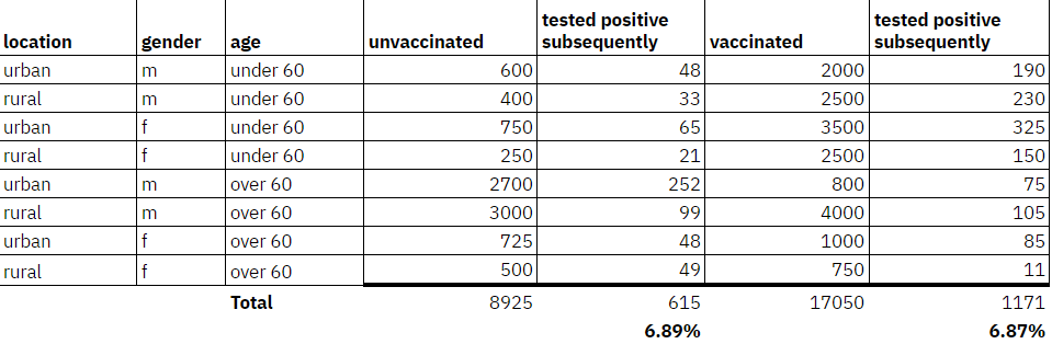
Amongst those who are vaccinated the incidence of covid subsequent to vaccination is actually 0.02% LOWER than those who were not vaccinated.
How do you turn this around you wonder?
Half a hour later you come up with this astounding counterfactual:
Getting vaccinated could increase your chance of contracting covid by 5-7%!
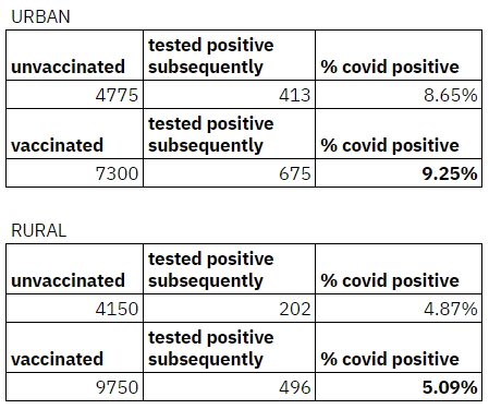
Our analysis of data shared by the State following its vaccination trial shows that this is consistent across both urban and rural populations
Notice that:
- On an aggregate basis the incidence of covid is the same whether one is vaccinated or unvaccinated i.e ~6.9% of the population
- The moment we partition along the lines of urban/rural, being vaccinated starts to show a higher incidence of covid positive post vaccination across BOTH cohorts i.e Urban: 9.25% vs 8.65% and Rural: 5.09% vs 4.87%
There is no cherry picking of data here.
No information has been selectively excluded.
All you have done is create a partition to change the narrative which is pretty hard to counter.

Is the partition real?
The crux of the problem comes down to the determination of causality.
Is there a reason why whether a person is an urban or rural dweller should stand to make a difference to their physiological ability to contract covid?
If the answer is NO then the partition is nonsensical.
There are real partitions of course.
The best case in point being the UC Berkeley Gender Bias Lawsuit
In this case, if the partition was along the lines of age it might be worth a closer look (because it is well established that the impact of covid varies by age):
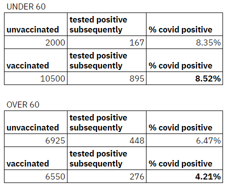
At last some kind of explanation emerges.
It is possible that those under 60, who represent the working age population, dropped their guard and returned to work / commenced travel post vaccination leading to the slightly increased incidence. The over 60 cohort, otoh, continued to stay vigilant and incidence of covid reduced.
On Twitter at least, I see only one really sharp person repeatedly calling out faux partitions when it comes to covid analyses:
This idiot doen't get Simpson's paradox.https://t.co/6GGE0MsB59 https://t.co/gECoeIJb0P
— Nassim Nicholas Taleb (@nntaleb) July 30, 2022
LAST BS BUSTING OF 2022
— Nassim Nicholas Taleb (@nntaleb) December 31, 2022
1/ Epoch Times, the conspiracy sheet, claims boosted is worse than vaxxed & report claims by Robert Malone as to the ineffectiveness of vaccines. Then provide data showing EFFECTIVENESS of vaxx (up to 92% lower death) and they fall for Simpson's paradox. pic.twitter.com/QuWQMIueW4
Simpson's paradox.
— Nassim Nicholas Taleb (@nntaleb) January 10, 2023
Why is it so hard?https://t.co/6GGE0MsB59 https://t.co/OvGcGYWV3R
Avoiding Inadvertent Groening
Every data point comes with a far longer list of features/attributes than in the past making a zealous data analyst prone to inadvertent groening.
Here are a few things one can do to avoid unintentional groening:
1. Inversion
Invert your null hypothesis and attempt to prove it.
2. Parsimonious Partitions
If you cannot make sense of why a partition produces counter intuitive results examine/avoid that partition.
3. Keep it Simple
Build and operate simple models as far as possible so that explainability is maintained.
4. Measure what Matters
Collect as much data as possible that pertains to relevant / causal features. Avoid the temptation to create more features just because data has been collected if there is no clarity on causal impact.